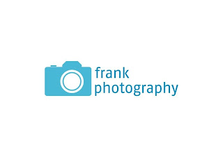
This is a logo that I did for a freelance photographer last year. For starters I wanted to keep the logo simple and clean looking because it had to be used on a business card, stationary and other various promotional items. One of the first ideas that came into my head was to do some sort of illustration of a SLR camera, I thought that this idea would work best if it was simple so I designed a vectored drawing of a SLR camera that could be reduced down in size and still look like a camera and not a blue rectangle. The main thing that I wanted to get right with the logo was the typography, I wanted to use a font that would look really nice when it was reduced down to business card size, the font that I chose to use is called 'FF Fago' and I think that it works really well alongside the camera symbol. This was a really nice project to work on because I had full creative freedom and the client was chuffed to bits with the finished result.


Sometimes simple is best. I am designing a logo for a client at the moment but she has a really complicated, messy idea which I'm not really liking. Trying to simplify it for her but its tricky!
ReplyDeleteI totally agree! Its such a pain when the client is like that, I'm sure you will sort it out though.
ReplyDeleteI'm glad you can edit your posts because my grammer was appalling in the last sentence of my post. I shouldn't write things when I'm tired.
I will let you know how I get on!
ReplyDeleteJust a point, you might want to change the time in your blog settings as apparently you posted this at half 4 in the morning?
Brilliant!
ReplyDeleteYeah I know, I've got to sort it out! =]